Vivid Pathology
Patient Focused Care, Physician Minded Process, Timely Results.
We were contracted to provide a complete name rebrand, logo design & trademark, digital assets, printed collateral, responsive website, social strategy, online presence, and reputation management.
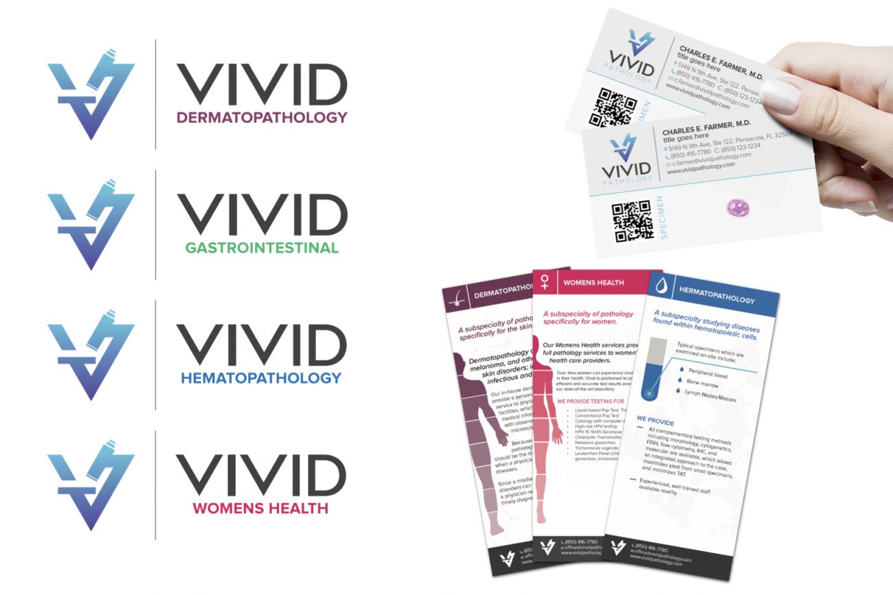
One of the things we wanted to do was to bring key elements of pathology into the design. Microscopes and slides are foundational to their work and we felt it was important to the brand. We found ways to incorporate both the visual aspect of a microscope into the logo and the use of transparent business cards to mimic the slides used everyday. The slides are how they identify a specimen and we felt it was a great way to identify the Physicians and the staff.
Subspecialties
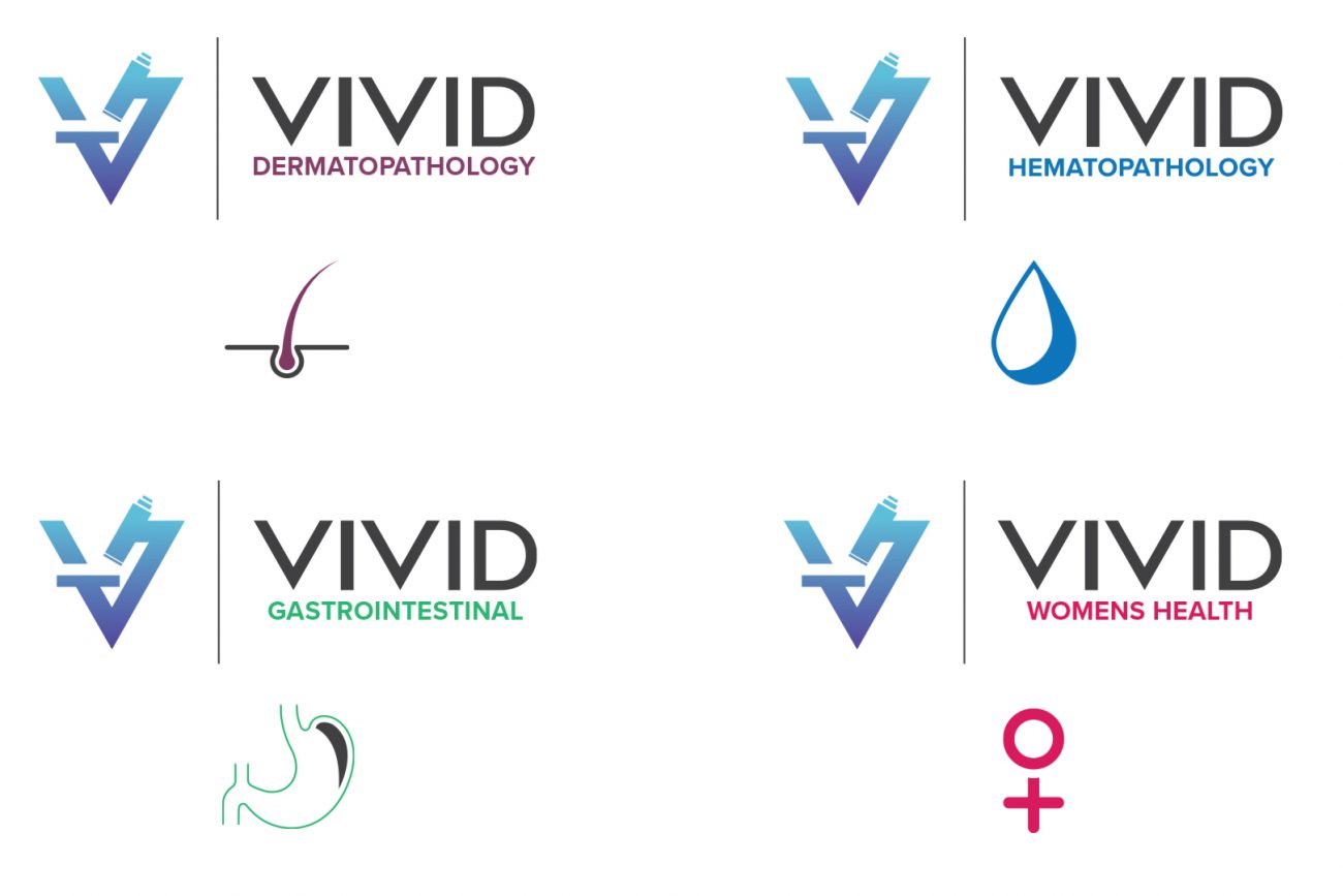
Vivid Pathology has 4 key subspecialties they needed highlighted both as part of their services but also to reflect the Board Certification of their physicians. We felt they needed to be seen as part of the Vivid brand but easily identifiable through the use of iconography and color.
COLOR CHOICE
It was important that we used colors that both reflected the subspecialty but also did not create confusion with other prominent medical brands in the area that Vivid service. Equally Vivid wanted for patients and physicians to see an icon that clearly represented the service being provided.
CLIENT
Vivid Pathology
Since
2016
SERVICES
Business Name Change, Brand Development, Website, Printed & Digital Collateral, Online Presence, Reputation Management.
VISIT WEBSITE


